Opening titles for "Paris est à nous"
A movie by Elisabeth Vogler
Production: Netflix
A movie by Elisabeth Vogler
Production: Netflix
Visual Direction: Nina-lou Giachetti
Design & animation: Romain Gauthier, Benjamin Geffroy, Nina-lou Giachetti, Paulin Girard, Anais Mak
Orchestral original music: Jean-Charles Bastion
Electronic original music: Laurent Garnier
Design & animation: Romain Gauthier, Benjamin Geffroy, Nina-lou Giachetti, Paulin Girard, Anais Mak
Orchestral original music: Jean-Charles Bastion
Electronic original music: Laurent Garnier
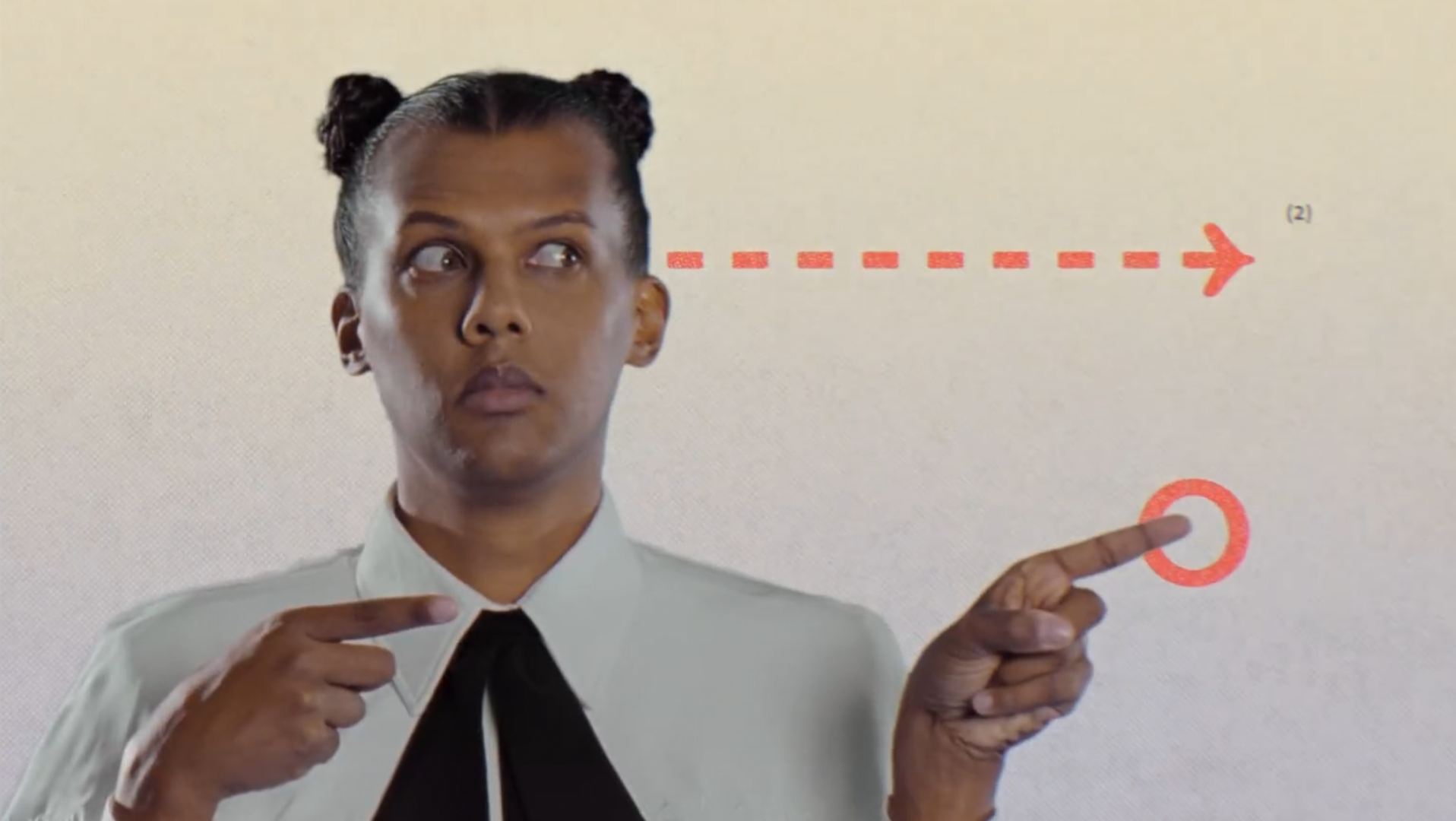
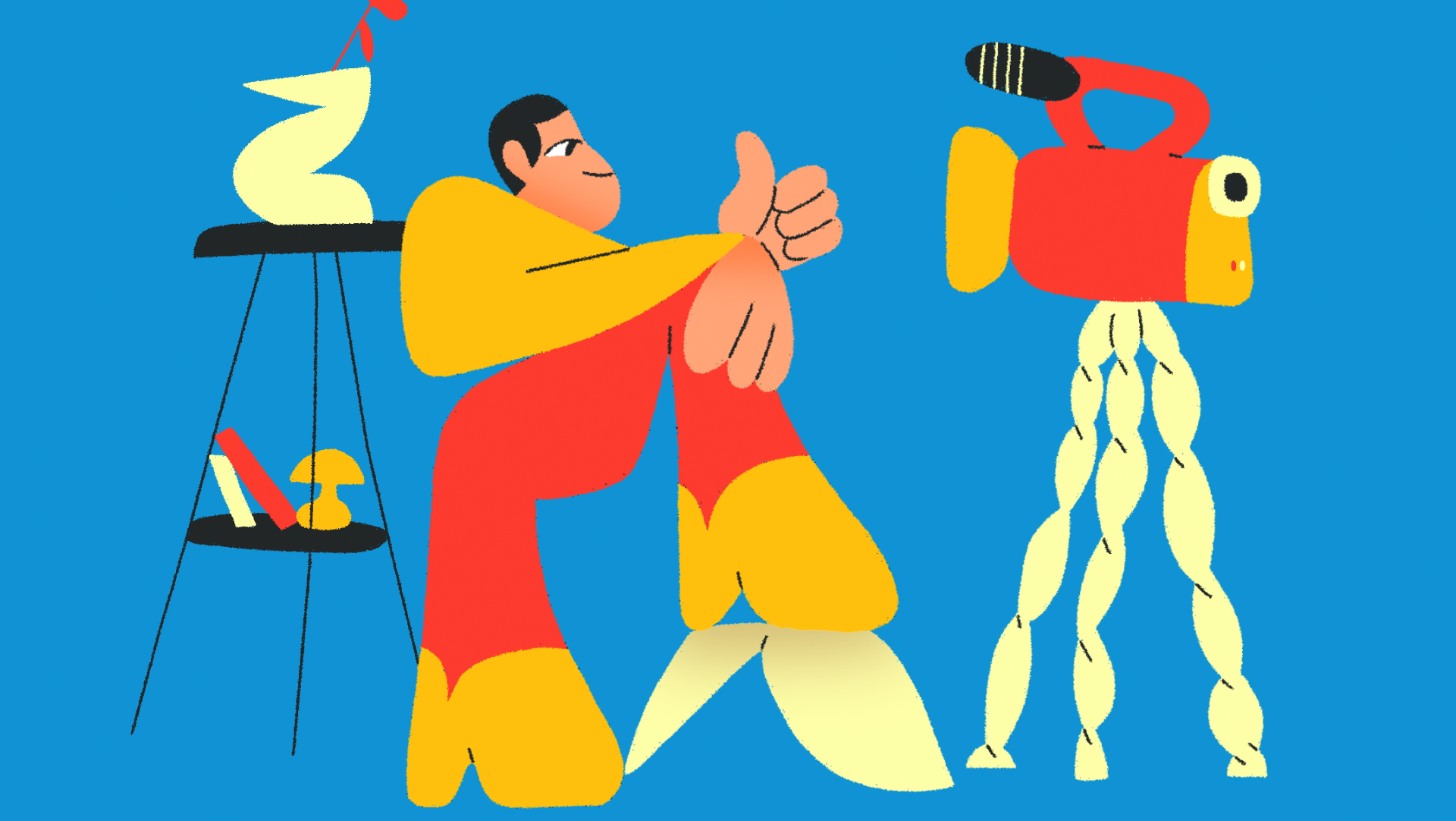
We had the opportunity to work on these opening titles by contacting the director of the movie (Elisabeth Vogler) after seeing the crowdfunding of their film on social networks (with Anais Mak, Romain Gauthier, Benjamin Geffroy, Paulin Girard). I had the idea of having a collaborative work, and the director liked it since the film was also based on this idea.
I started by pitching some styleframes to explain what I had in mind, and then each one of us had to develop their parts the way they wanted, just following some basic rules and guidelines I created to keep some continuity.
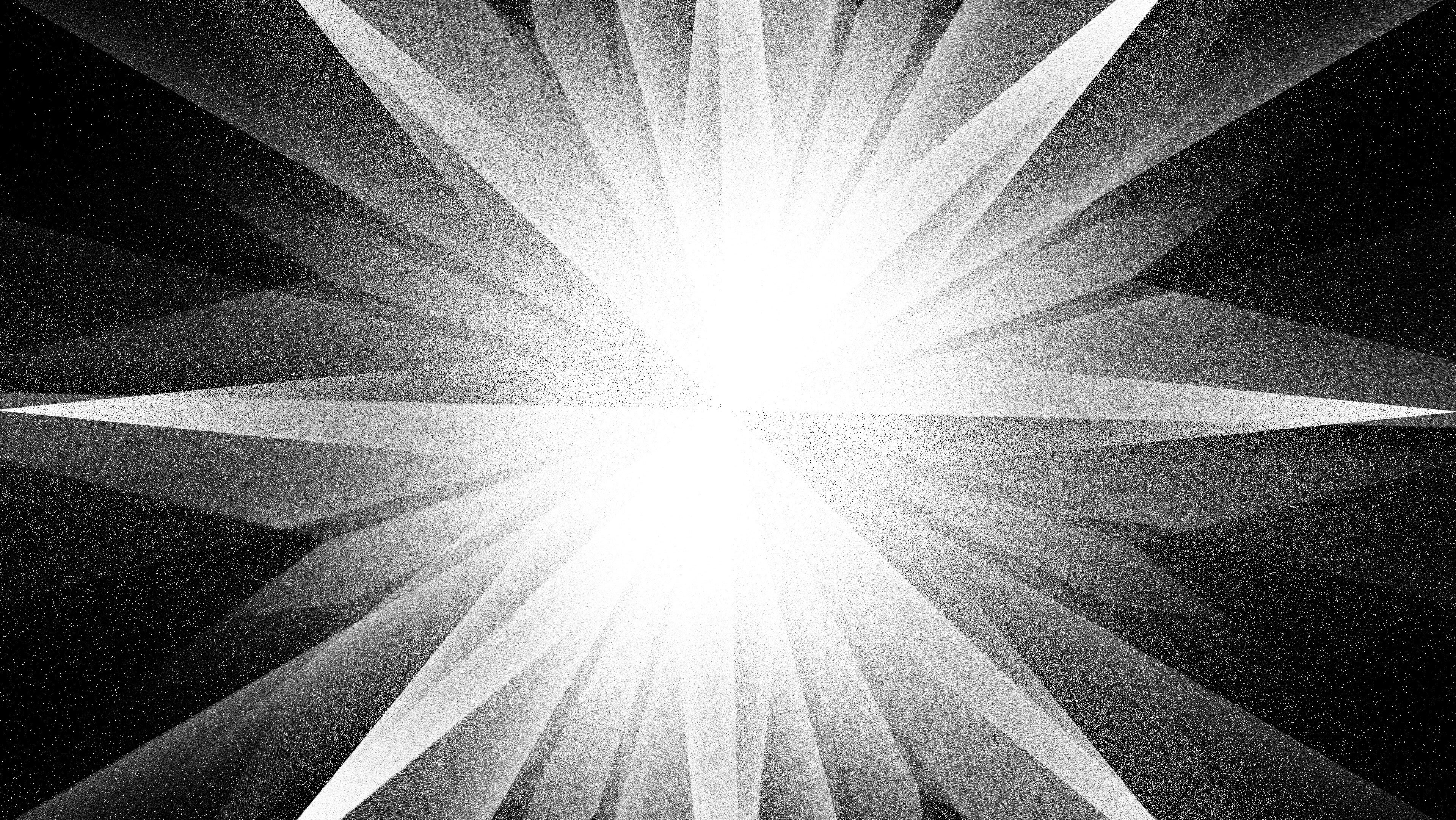
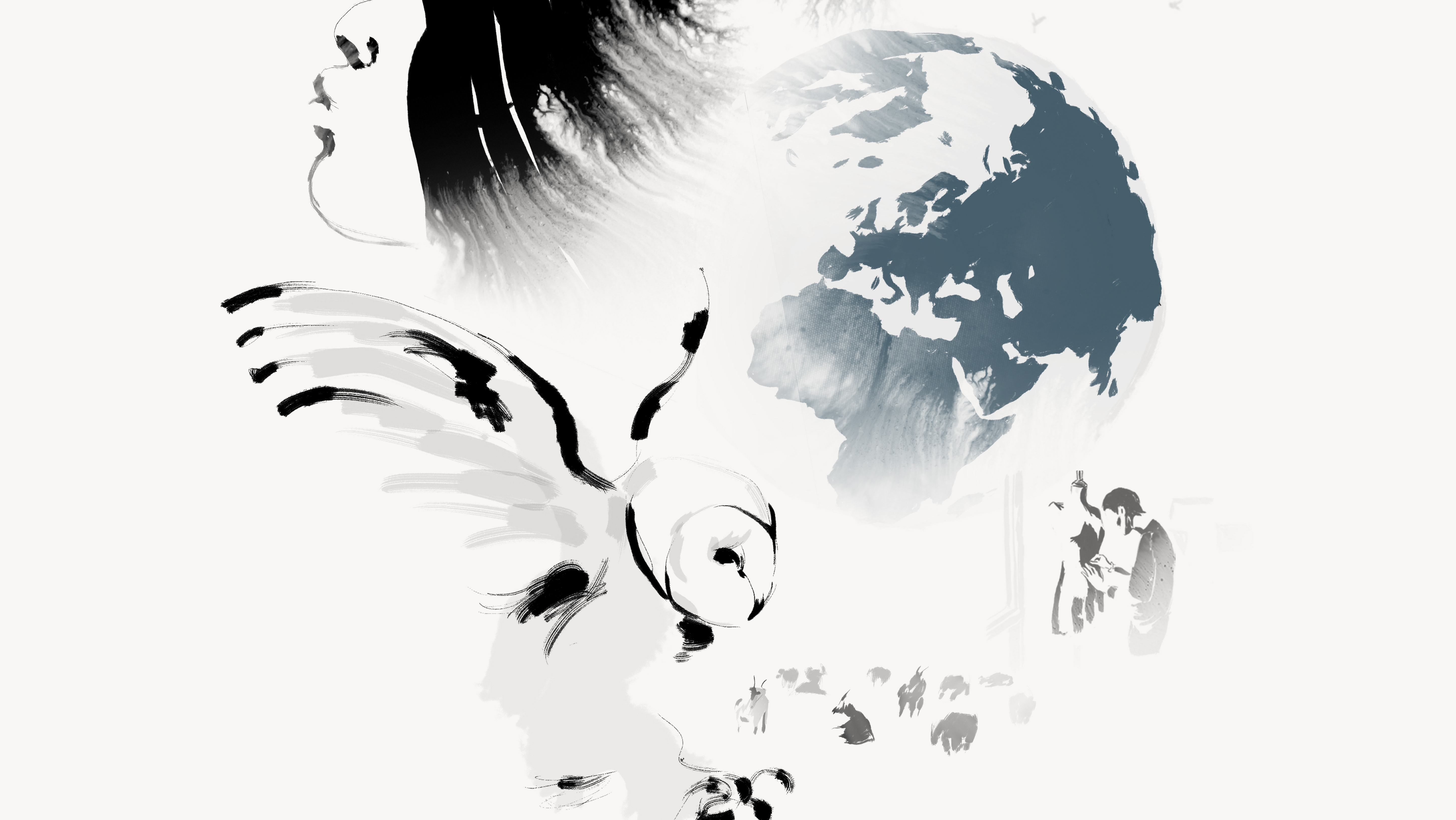
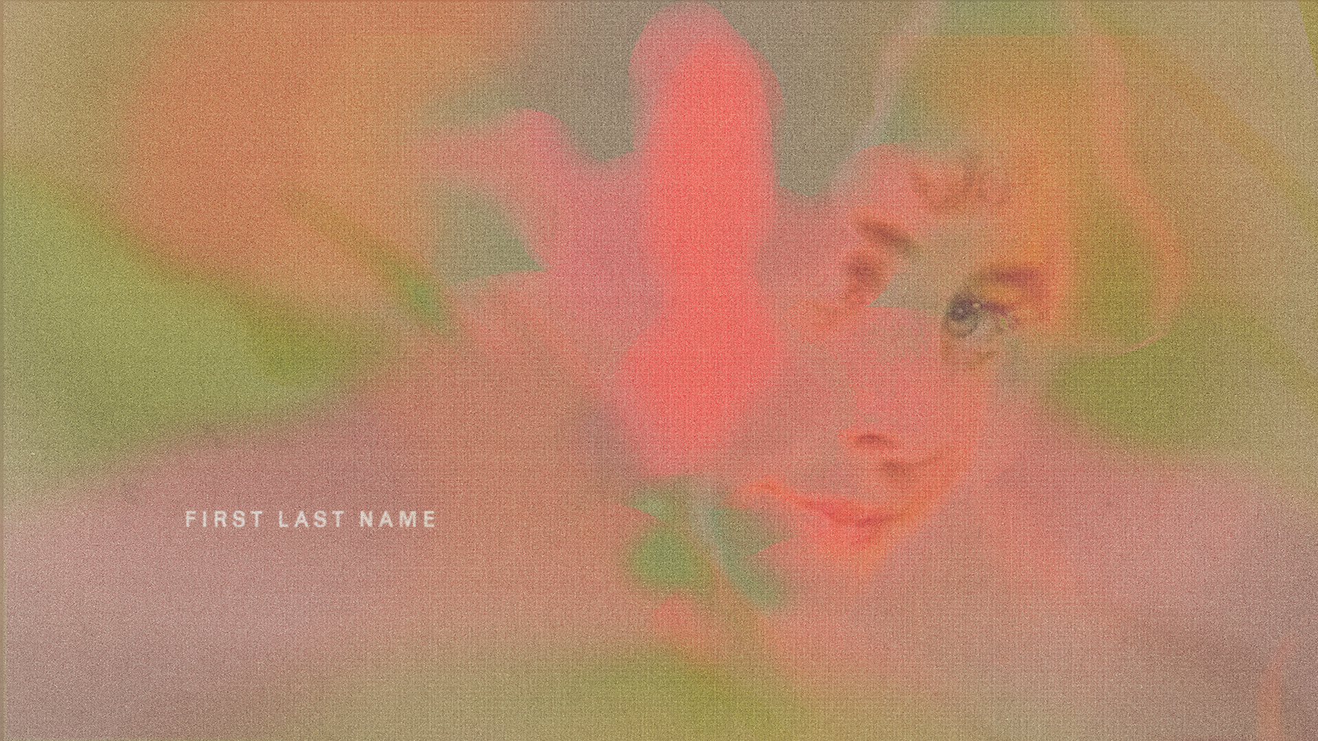
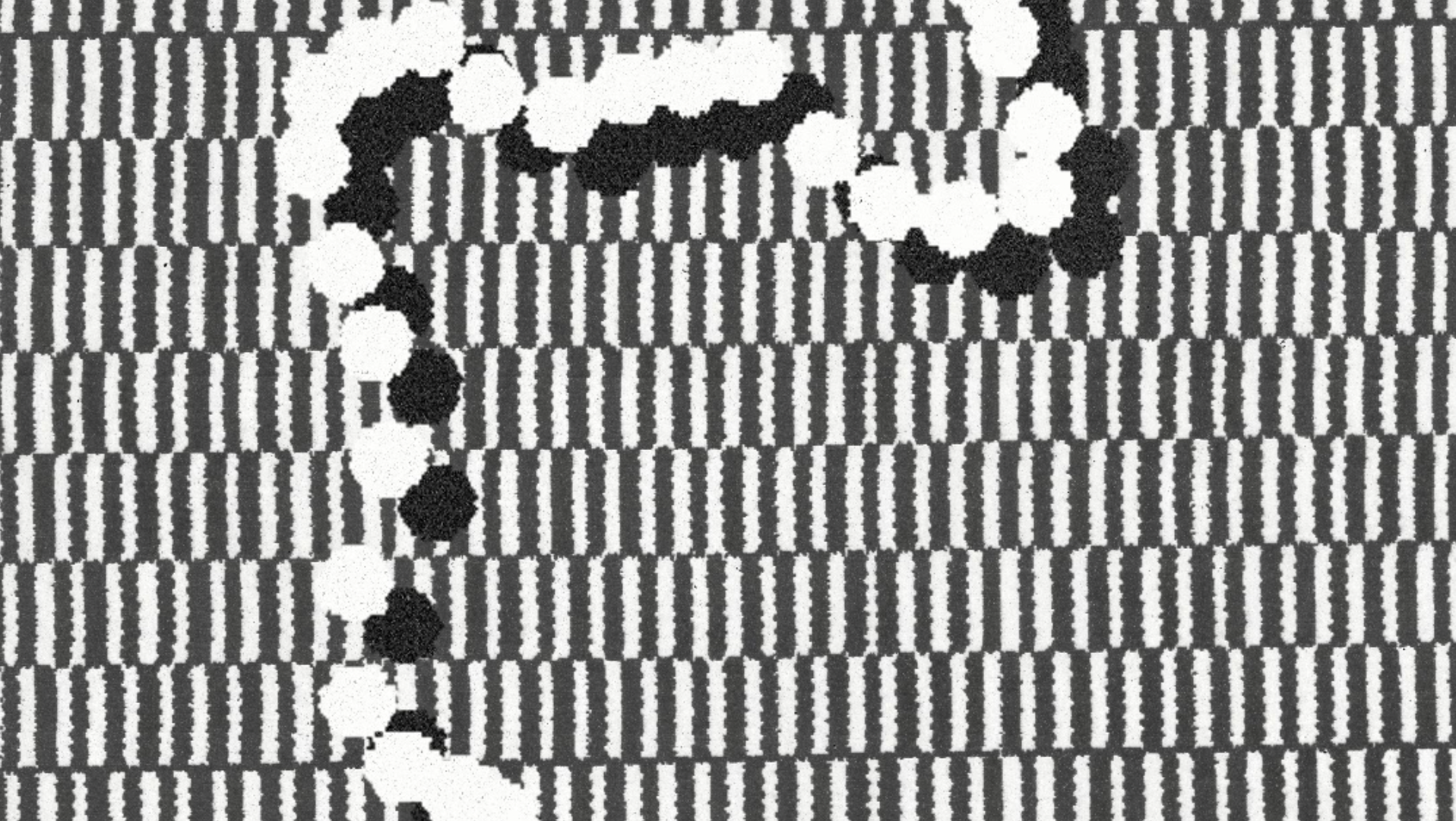
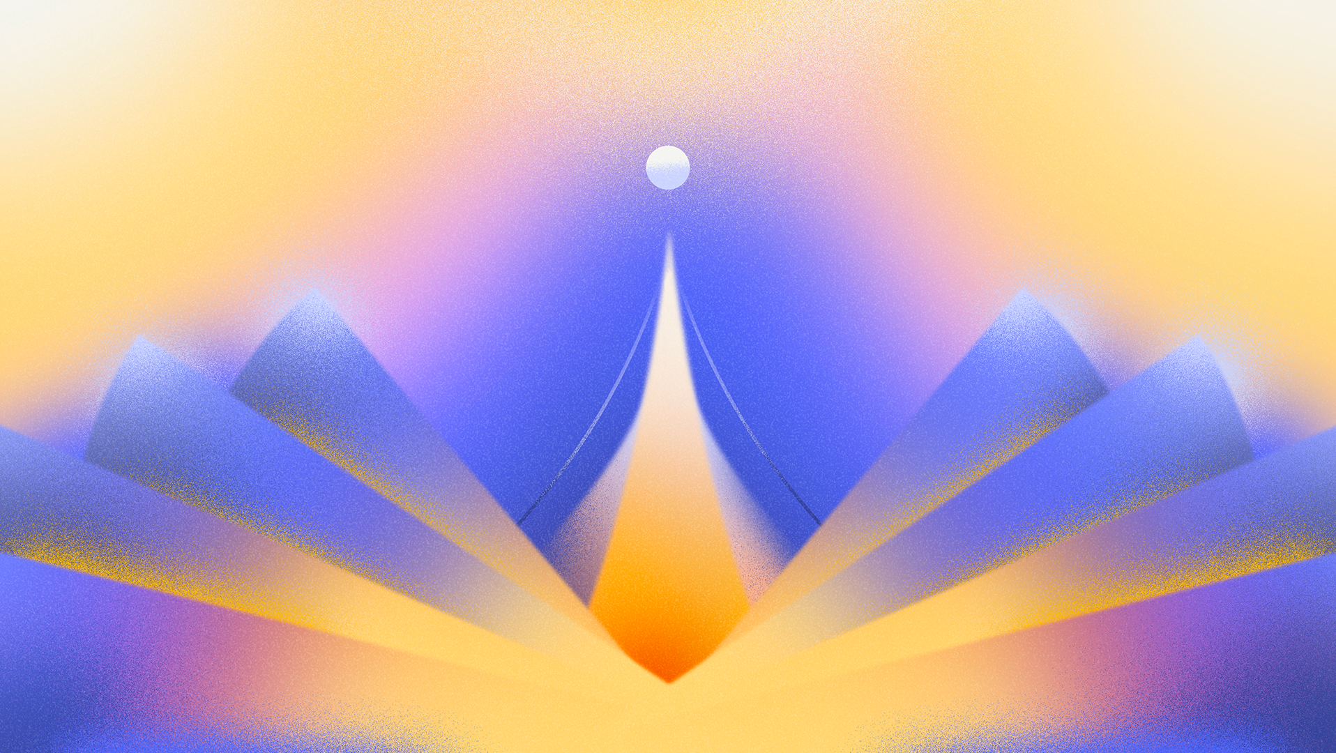
The rules were mainly to create abstract compositions inspired by the shapes of letters from the cast's name on screen... but distorted, repeated, enlarged (...) Keeping in mind that the title sequence had to visually represent the sense of getting high, as well as vertigo. In order to do that, each one of us had to work on hypnotizing compositions. On the other hand we also had to find some pictural guidelines using colors and textures to harmonize our work.
The rules were mainly to create abstract compositions inspired by the shapes of letters from the cast's name on screen... but distorted, repeated, enlarged (...) Keeping in mind that the title sequence had to visually represent the sense of getting high, as well as vertigo. In order to do that, each one of us had to work on hypnotizing compositions. On the other hand we also had to find some pictural guidelines using colors and textures to harmonize our work.
So we all made a bunch of styleframes (we used a mix of 2D and 3D) and shared our work when ready. Then I made an animatic sequence in the best way possible, connecting all these images together. After that, each member of the team had to develop a second draft on their part, according to this animatic. While working on this, Jean-Charles Bastion was writing the music that was going to be synced on our images. We shared our work at multiple times, as in a ping-pong game, that was very interesting ! The orchestral music was by the way recorded by a real orchestra, in a particular reverberant space that also contributed to add vibrance to the final result. As a matter of fact the soundtrack of the film was also a collaborative project between Jean-Charles Bastion and the famous french techno artist Laurent Garnier.
By mixing abstract compositions based on the letters of the names on screen allowed to mix 2 visions, the words in their definition and the letters in their expression.
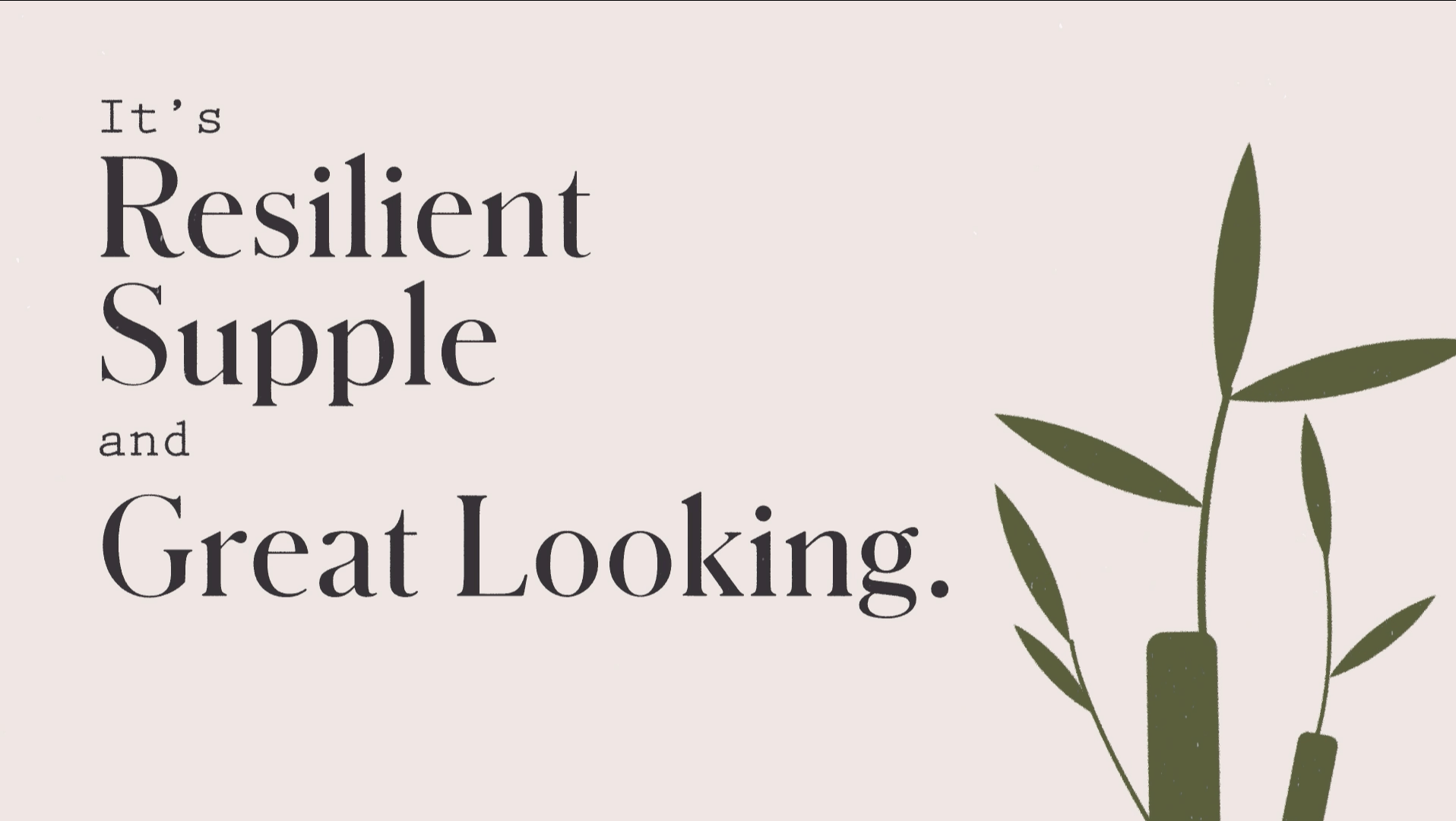
The typographic choice of using "Akzidenz" font was made in order to keep a peaceful uniform shape and also for its lineal graphical characteristics. Because I was Inspired by science books bottom page notes (Figures) I decided to associate "Akzidenz" with "Leitura".
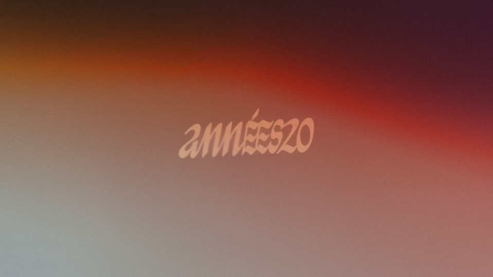
For the font of the titles we used Panamera, simple but with hidden distortion in it's structure. The title was thought to re-use the graphics of the opening credits but to create a transition from the end of the first sequence in the club to the actual beginning of the movie. By re-using the colors visible in the club, in an abstract way, it also reminds the viewer of the patterns seen at the end of the movie.
The end credit where made by another talented guy named Alexis Jaulmes.

